A visual marketing platform for brands that generate user photos on social media, e.g. tourism. CrowdRiff searches social media for keywords, influencers or geographic locations collects them and allows customers to interact with the content creators at scale, commenting on their photos and even ask for usage rights. This allows brands to then use high resolution versions of the images creating an ideal blend of authentic and aspiration imagery.
It can also house pre-existing purchased images and uses machine learning to identify and tag the contents of the photos as they're being uploaded.
CrowdRiff Product Video
The Challenge
In early 2016 CrowdRiff raised $2M in seed funding and wanted to evolve their product. There was no clear vision for the product or agreement on who it was for and what its key value propositions were. The interface had grown over the years mainly due to specific client requirements and didn't function as a cohesive feature set. In addition, the development process was opaque to other parts of the company leading to confusion about what was being worked on and when features might be completed.
My Contribution
I focused my efforts on strategy, process and design. From a strategic standpoint, I wanted to understand what would make the product successful and then build a team and practice to achieve it. I worked on articulating the product vision, audience and value propositions. I also worked to define the product roadmap in an effort to support the business strategy.
I updated the development process to be more transparent and collaborative, bringing our designers and developers into a unified team. We instituted frequent design reviews where product team members, customer support and even sales and marketing could join to provide feedback to improve the work. I defined service level commitments to customers in order to prioritize bug fixes and ran the backlog and our weekly sprint planning and retrospectives.
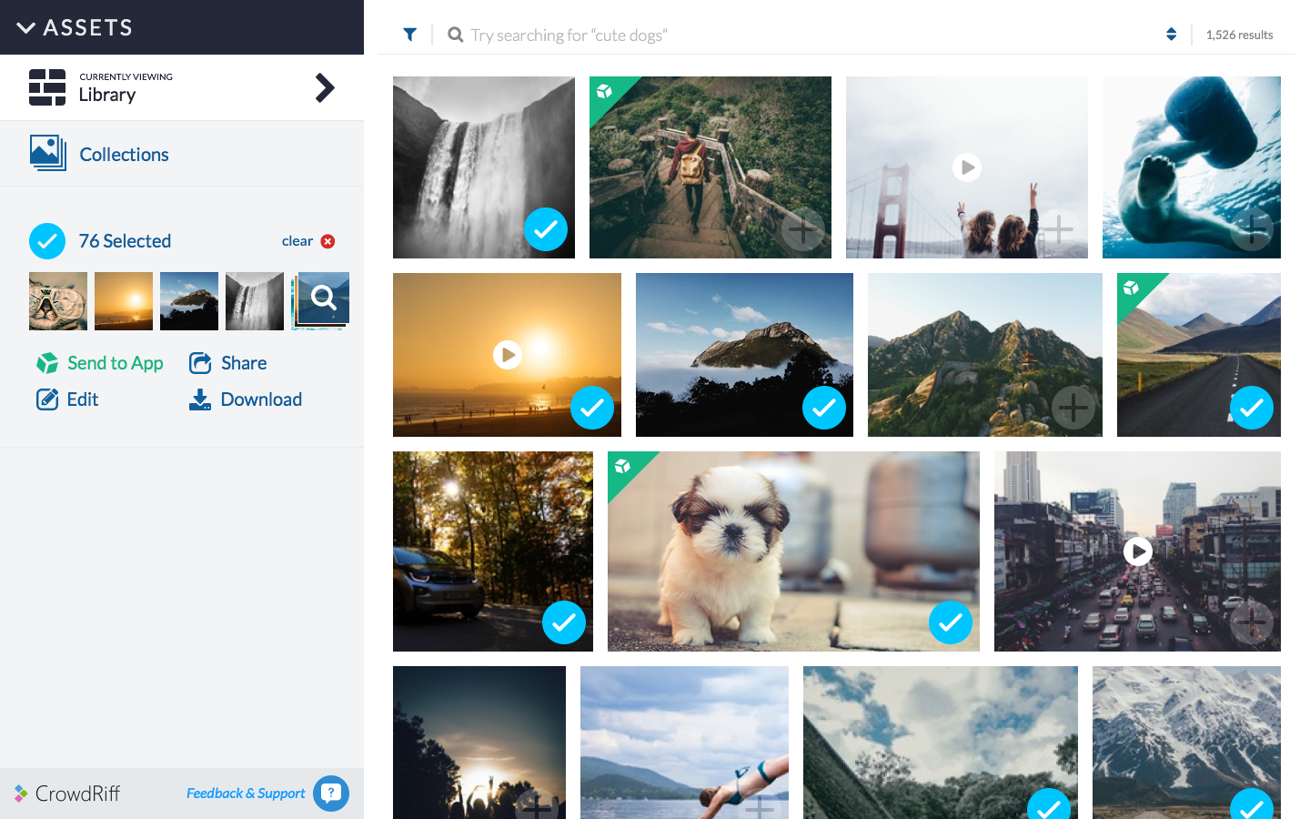
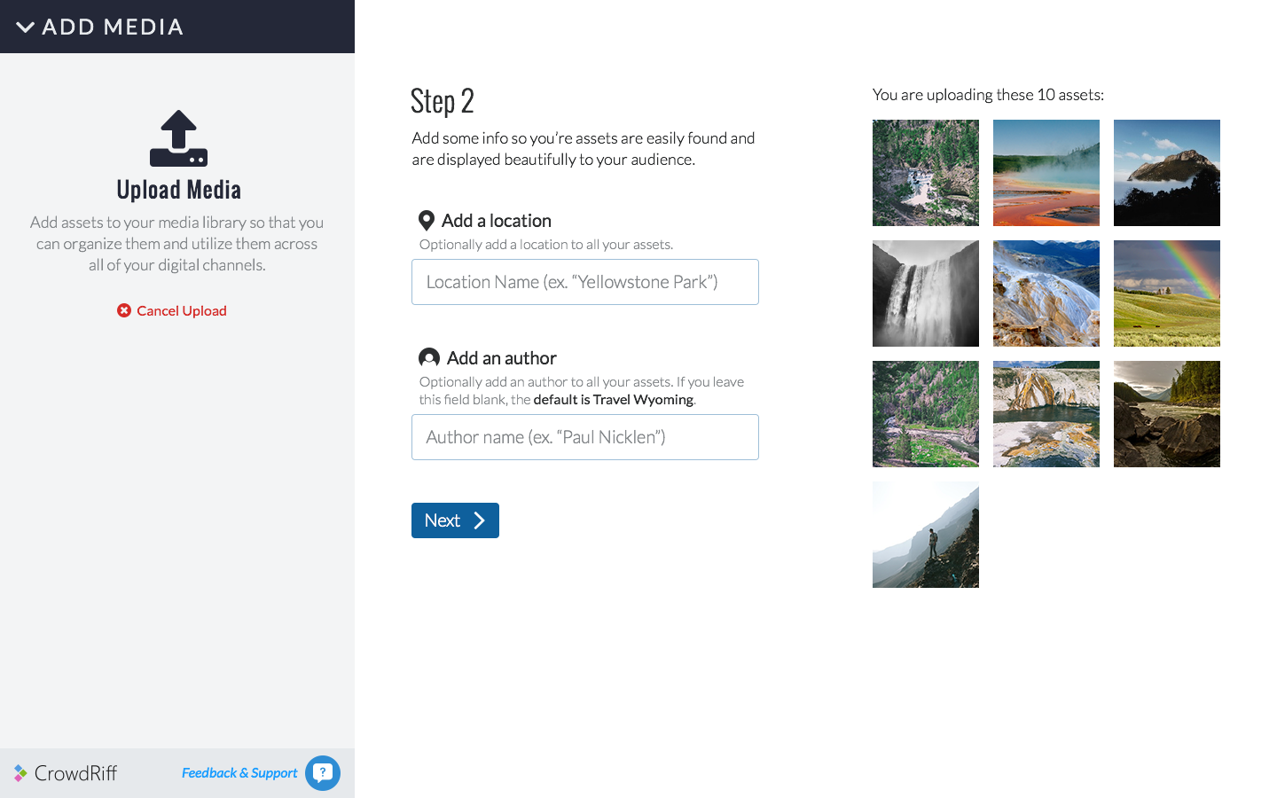
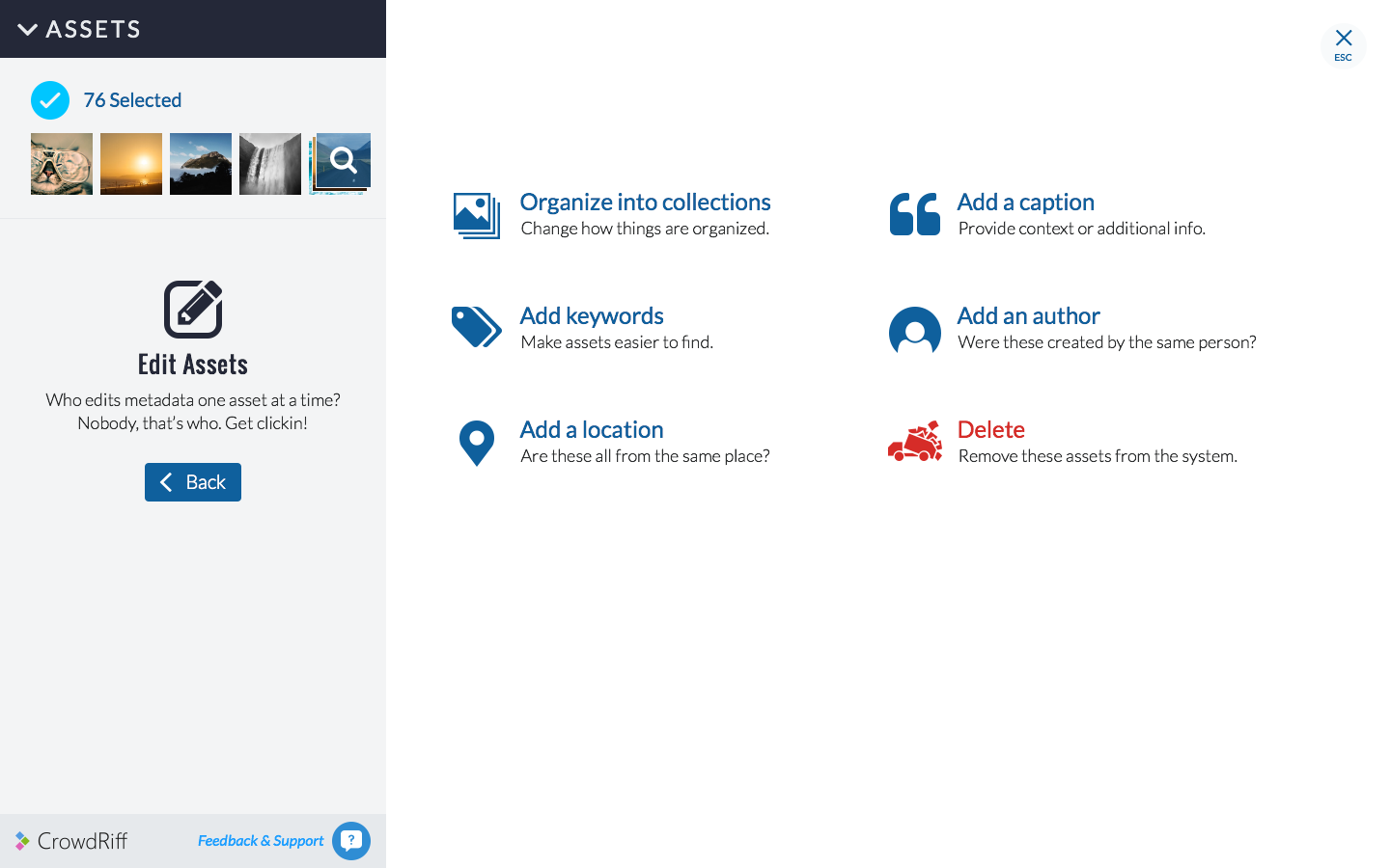
My main focus however was design, where I updated the brand and worked with the CEO to understand where he wanted to take the product and then create the workflows and interface to achieve that. We designed a new "app workflow" to allow customers to select photos and send them to various "apps" to act upon them (e.g. sharing, archiving, applying computer vision for classification). I also designed the interface with my team for the new version, with a strong focus on simplicity and speed. Finally, I created the Early Access Program which was a beta channel for select customers to get advanced access to features under development while providing us with critical feedback and bugs.
The Approach
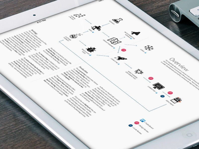
We started with strategy, defining what the product actually was and why our customers bought it. We identified our customer segments and selling propositions and worked on ways to best communicate the value of the product. Knowing what we were trying build, we started thinking about how we were going to go about building it.
The strategic documentation
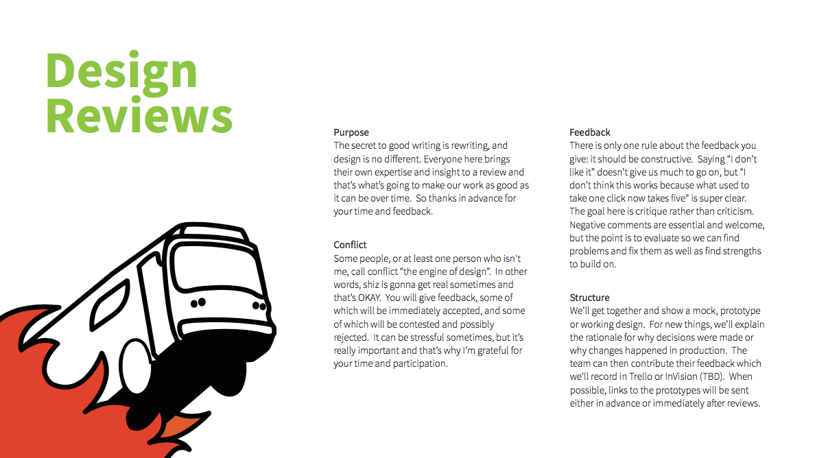
We created a new process that focused on transparency and collaboration. Feature requests were weighed against the overall strategy to produce a roadmap that fed our backlog. Sales and marketing were included in feature selection and also kept up-to-date so they could begin promoting the features as they became available. Development was structured to allow us to create the new features for the next version while incorporating them into the existing platform as much as possible to keep it from stagnating. This was akin to fixing a moving car, but the solid development team at CrowdRiff did a fantastic job. Collaboration happened mainly through design reviews which were held as needed by anyone on the product team to evaluate their work. This meant developers were helping to refine design concepts and designers were helping ensure we had executed working code to the highest standards.
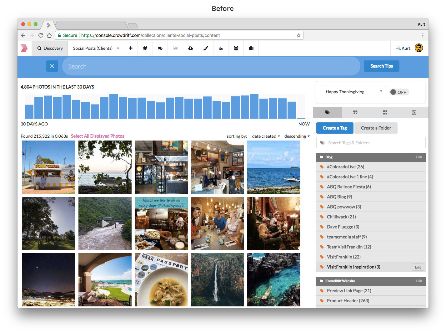
There were two major design initiatives: updating the brand to a modern, cohesive system and a complete reworking of the application's workflows. The main objectives for the brand update were to make the logo more visible and versatile. We also rationalized the fonts across the site and the application.
The new UI put visuals front and center, with simplified workflows that allowed users to work on large numbers of images simultaneously. The biggest innovation was the bundling of several features into an "app" framework, allowing users to select photos and then send them to the apps that performed the desired functions. This increased throughput considerably and also made the product far more extensible.
Finally, we created a beta-program called the Early Access Program in order to solicit feedback and have customers help us test and refine new features before fully rolling them out.


Results
During my time at CrowdRiff, we were on a fairly steady 3-6x growth rate. Many of our largest customers renewed or expanded their contracts and referred new business to us based on the new functionality we incorporated into the old platform and the glimpses they saw of the upcoming version. We received extremely positive feedback from customers in the early access program and CrowdRiff is continuing to build off the new version today. I left the product in the capable hands of a fantastic team. You can see what they're up to at www.crowdriff.com.
To comply with my confidentiality agreement I have omitted and appropriated confidential information. These designs are a reinterpretation of the original or iterations from earlier in the process.

